Publishing 작업 중 배경 이미지를 넣어야 할 경우 반응형으로 맞춰야하기 때문에 곤란한 경우가 있다.
어느 해상도에서나 특정 모양을 맞춰줘야 하는데
일단 repeat은 빼는게 맞고 화면에 다 보여줘야 하니까 background-size는 contain을 해준다.
그렇게 되면 여백이 생긴다는 문제가 있다.
그래서 한가지 노하우를 공유하고자 한다.
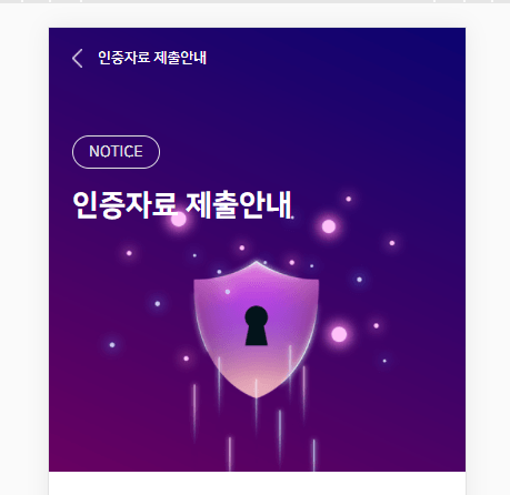
예를 들어 이런 모양일 경우
가운데 방패 모양이 항상 중앙 쪽에 위치해야 한다.
그럼 background-size: cover를 주고
중요한 것은 background-position을 퍼센트로 주면 된다.
example
이때 주었던 CSS를 예시로 올리겠다.
.bg-img {
  background-image: url(../img/information-auth-data/header-bg.png);
  background-size: cover;
  background-repeat: no-repeat;
  background-color: purple;
  background-position: 40% 73%;
  height: 400px;
  position: relative;
}